Monday 27 January 2020

Friday 17 January 2020

sql query to find non-singleton clone groups

select CID,size from
(SELECT distinct(clusterID) as CID, count(clusterID) as size FROM `cluster`
group by clusterID) as t
where size>1


Monday 6 January 2020

Switch columns to rows in Excel

The solution is to use the TRANSPOSE function

Follow instructions here:
https://support.office.com/en-us/article/transpose-function-ed039415-ed8a-4a81-93e9-4b6dfac76027

Step 1: Select blank cells

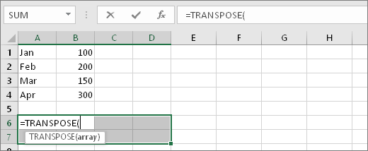
First select some blank cells. But make sure to select the same number of cells as the original set of cells, but in the other direction. For example, there are 8 cells here that are arranged vertically:
Cells in A1:B4
So, we need to select eight horizontal cells, like this:
Cells A6:D7 selected

This is where the new, transposed cells will end up.

Step 2: Type =TRANSPOSE(

With those blank cells still selected, type: =TRANSPOSE(
Excel will look similar to this:

=TRANSPOSE(
Notice that the eight cells are still selected even though we have started typing a formula.

Step 3: Type the range of the original cells.

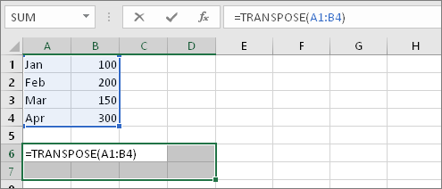
Now type the range of the cells you want to transpose. In this example, we want to transpose cells from A1 to B4. So the formula for this example would be: =TRANSPOSE(A1:B4) -- but don't press ENTER yet! Just stop typing, and go to the next step.
Excel will look similar to this:
=TRANSPOSE(A1:B4)

Step 4: Finally, press CTRL+SHIFT+ENTER

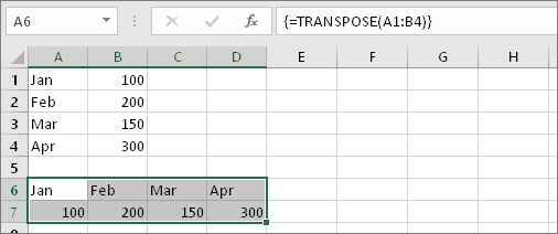
Now press CTRL+SHIFT+ENTER. Why? Because the TRANSPOSE function is only used in array formulas, and that's how you finish an array formula. An array formula, in short, is a formula that gets applied to more than one cell. Because you selected more than one cell in step 1 (you did, didn't you?), the formula will get applied to more than one cell. Here's the result after pressing CTRL+SHIFT+ENTER:
Result of formula with cells A1:B4 transposed into cells A6:D7

Wednesday 1 January 2020

Code for making color pack visualization in R using custom dataset

library(ggraph)
library(igraph)
library(dplyr)


df <- data.frame(group=c("root", "root", "a","a","b","b","b"), 
                 subitem=c("a", "b", "x","y","z","u","v"),
                 size=c(0, 0, 6,2,3,2,5))

# create a dataframe with the vertices' attributes

vertices <- df %>%
  distinct(subitem, size) %>%
  add_row(subitem = "root", size = 0)

graph <- graph_from_data_frame(df, vertices = vertices)

ggraph(graph, layout = "circlepack", weight = size) +
  geom_node_circle(aes(fill =depth)) +
  # adding geom_text to see which circle is which node
  geom_text(aes(x = x, y = y, label = paste(name, "size=", size))) +
  coord_fixed()

Code for making a color pack visualization in R using flare dataset

library(ggraph)
library(igraph)
library(tidyverse)
# We need a data frame giving a hierarchical structure. Let's consider the flare dataset:
edges <- flare$edges

# Usually we associate another dataset that give information about each node of the dataset:
vertices <- flare$vertices

# Then we have to make a 'graph' object using the igraph library:
mygraph <- graph_from_data_frame( edges, vertices = vertices )

# Make the plot
ggraph(mygraph, layout = 'circlepack') +
  geom_node_circle() +
  theme_void()

ggraph(mygraph, 'treemap', weight = size) +
  geom_node_tile(aes(fill = depth), size = 0.25) +
  theme_void() +
  theme(legend.position="none")


what is a good PhD contribution?

When PhD candidates embark on their thesis journey, the first thing they will likely learn is that their research must be a “significant ori...